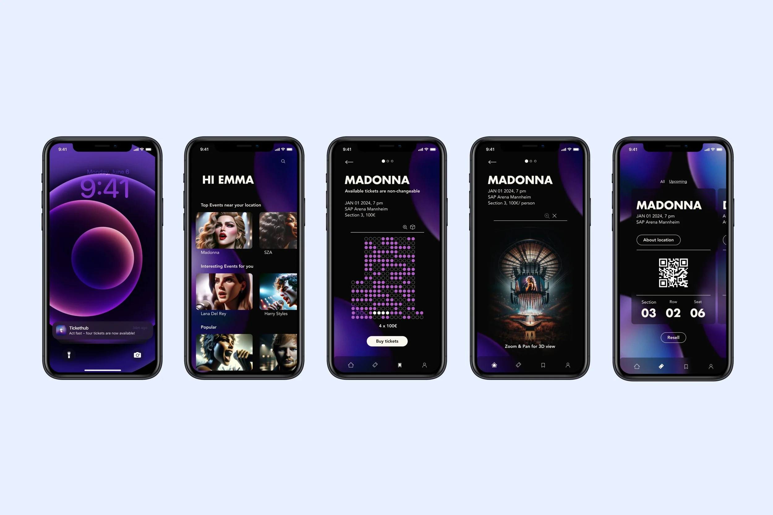
TICKETHUB
Conceptual and visual overhaul of the current Ticketmaster app.
course
application design by
Sandra Raab
year
2024
timing
5 months
team
Emily Kühl
Viktor Strömberg
my role
concept
visual design
ux design
typography
problem
The Ticketmaster app is a prominent platform that allows customers to purchase tickets and access them directly using their smartphones. By using technology to improve the search and purchase of tickets, Ticketmaster has achieved global success. However, the usability of the app currently suffers from certain areas such as app navigation, seat selection and personalized event recommendations which require attention. Ticketmaster has the potential for modernization and could benefit from a comprehensive analysis to eliminate weaknesses.
competitor analysis
Initially, we conducted a comprehensive analysis of our competitors to gain insight into the market and define our product target. This enabled us to gather valuable information and identify the critical areas for developing a product with a broad customer appeal. Throughout the analysis, we focused on the key parameters of competitor apps, such as content, structure, usability and design. Meticulously scrutinizing apps such as Resident Advisor, Eventim, Billetto and Eventbrite, we listed their features in a table, categorized them and highlighted strengths, weaknesses and opportunities.
research
online Survey
Subsequently, we conducted an online survey with 80 participants to gain valuable insights into the preferences and requirements of our target audience by capturing general user background, purchasing behavior, ticket purchase app preferences and interest in potential additional features.
how might we questions
After identifying pain points in the current Ticketmaster app using our online questionnaire, we formulated 'how might we' questions to guide our conceptual
and design approach. These questions aimed to turn insights into opportunities and develop innovative solutions. The first question focused on improving the clarity of seat selection for different price categories, while the second question explored the implementation of a new feature based on high demand that allows ticket buyers to resell tickets in case of illness. The third question related to ensuring personalized event recommendations on the home screen.
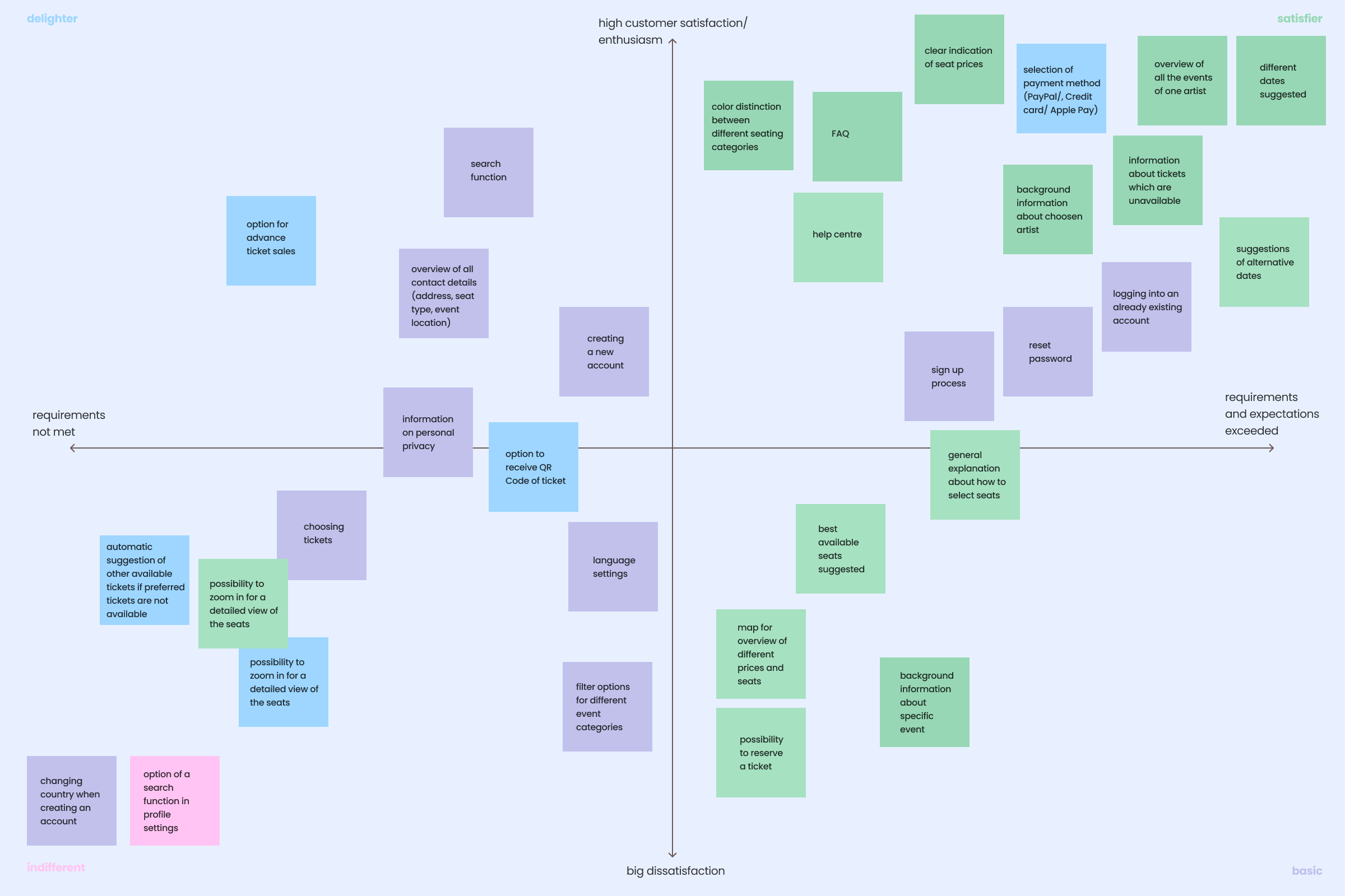
kano model
In the following phase, we categorized the functions and features according to relevance for the user and need for optimization by using the Kano model and prioritized the requirements, development tasks and customer wishes. The Kano model, represented in a qualitative coordinate system, assessed customer satisfaction and the fulfillment of expectations for each function. We highlighted basic functions such as the search function and registration in blue, satisfactory functions such as ticket reservation and background information on the event in green, enjoyable functions such as QR code reception and seat enlargement in yellow and dangerous functions such as the difficulty of choosing a seat in red. Additionally, we highlighted potential opportunities for new features in purple, such as a list of previous ticket purchases or ticket resale options. After prioritization, an order of precedence emerged for retaining, revising and integrating features into our app.
concept
design brand filters
To align our users' experiences with the brand identity and ensure consistent and relevant interactions, we applied the Design Brand Filter Framework. We focused on four main attributes: Reliability, Informativeness, Structure and Personalization. Reliability ensures an intuitive design and clear navigation, while informativeness delivers structured and precise content. Structure ensures an accessible user interface, and personalization adapts the experience to individual preferences.

result
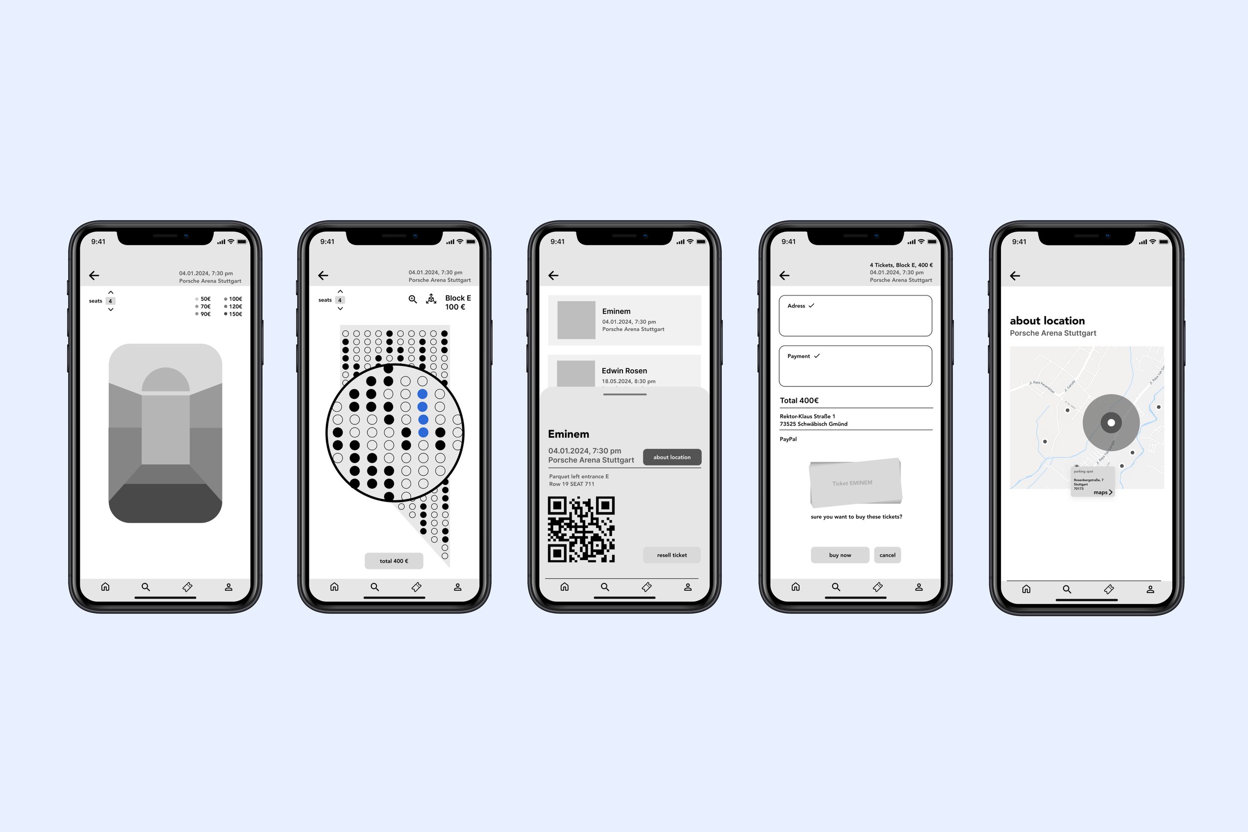
mid-fidelity wireframes
The next step was to implement our roughly sketched storyboard in mid-Fideliy wireframes in order to create a basis for the further development phase of the app.
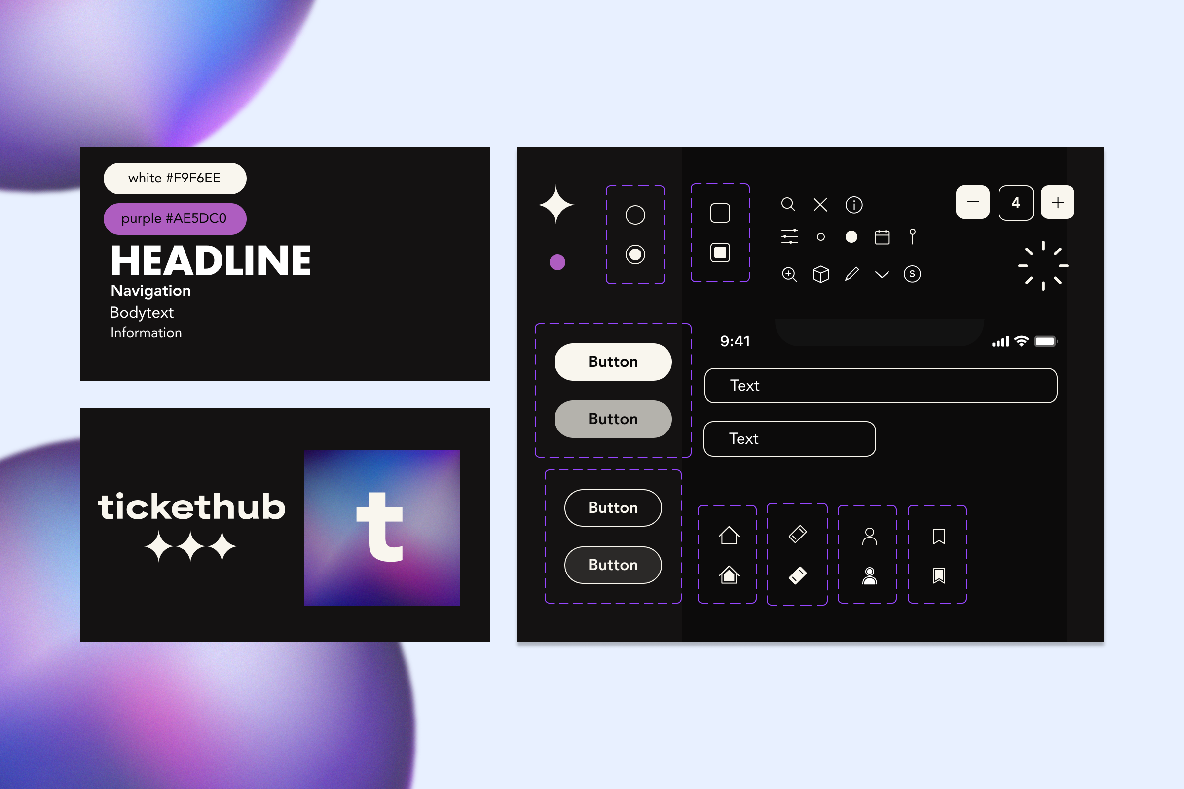
design system
To create a visually engaging design for our event and ticket sales app, we chose vibrant purple and pink tones for background circles to evoke creativity, energy, and entertainment. For typography, we selected the modern Futura in bold for headlines and the clear, legible Avenir Roman for body text. Our button hierarchy includes primary, secondary, and tertiary options, all styled with minimalist Radix Icons to fit our app's magical theme. Additionally, we rebranded the app from Ticketmaster to Tickethub, incorporating a star symbol in the new logo to inspire and complement the retro design elements.
learning
We learned that to effectively enhance the Ticketmaster app, we must identify and prioritize its most critical pain points. This approach allows us to set clear objectives and develop both a solid conceptual framework and a visually compelling design.
vision
Based on feedback from our users, we are planning to expand the app to include social media and community functions as well as the integration of a mobile wallet. Furthermore, we are focusing our development vision on sustainability and accessibility. We want to use digital tickets to reduce paper waste and offer environmentally friendly events. Further plans include voice commands, support for screen readers and customizable display settings for better accessibility.